|
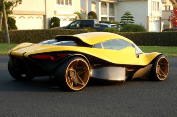
The forthcoming revival of the Dino brand
seems very natural and almost expected course of action, and
is already highly anticipated by Ferrari
enthusiasts around the world. In light of these exciting
developments,
Sasha Selipanov, a student
graduate of the
Art Center in Pasedena, has
presented the 'Dino Competizione', his perception of a
modern-day reinterpretation of this famous prancing horse
icon.
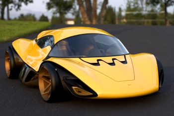
The Dino Competizione," says Selipanov, "is a unique
Ferrari in many ways. First of all it is relatively
inexpensive and as such, attracts a younger, more liberal
buyer. This allows for a much more bold and daring design,
in comparison to a more 'mature' Ferrari line-up, targeted at
an older, established crowd. Dino bears no Ferrari badges;
therefore, the exclusive image of the brand is not
endangered by a more available and inexpensive sibling. I
felt like all of these factors gave me a reason to create a
very progressive and fresh design statement. The challenge
was, however, to retain Dino's recognizable features but at
the same time provide something radical and unexpected.
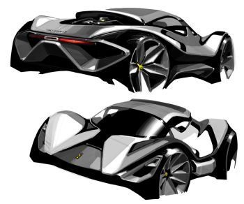
Aesthetic
themes explored with the Dino Competizione project
"The vehicle incorporates
deliberately complex and even decorative elements,"
continues Sasha. "Inspired
by Zaha Hadid's buildings and her design philosophy, organic
flowing surfaces are blended with overtly complex, yet
rhythmic, graphics and details. One of the challenges was to
create a clear system of 'reads' from various aspects. An
observer is meant to notice more as he/she approaches the
vehicle. The first read would be the yellow organic surface
and the traditional top-heavy Dino Competizione proportion;
the second read becomes obvious once the observer comes a
little bit closer and starts noticing the complex shapes of
the air intake and the add-on aerodynamic pieces; and
finally, the third and fourth reads become clear as the
observer notices the details such as the tail lights and
head lights, interior detail, door handle etc. Each one of
these read levels provides an equal amount of visual
excitement, therefore making the process of appreciating the
design much longer and much more intriguing. At the same
time, none of the reads fight with each other, they coexist
in harmony. To sum things up a little bit, creating an
extremely complex yet balanced design was the intention with
this project.
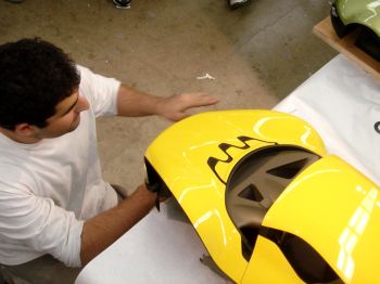
"The Dino Competizione design
was packaged around a mid-engine platform, dimensionally
similar to McLaren F1 super car," he says, adding, "I built several computer 3D
models using Alias Studio Tools, and once I felt comfortable
with the looks of the model, I printed it out using stereo
lithography (SLA) machines. The SLA technology is incredibly
expensive, but I got a lot of support from local car design
studios who were kind enough to print the parts out for
free. Usually students simply mill out their scale models
using a conventional 5 axis mill, but in case of my Dino
Competizione it was impossible to use the mill due to the
complexity of the design. SLA was used for the exterior and
interior, and even the clear glass parts were made from
special clear type of SLA. Fitting the parts together and
finishing the model consumed about 10 weeks in total, the
amount of different parts was overwhelming and there were a
few major fitting problems due to the extreme warping and
deformations that SLA parts usually go through.
|